| Which style to you like? Ignore colors! Pay attention to the objects in the logo! |
| Style 1 |
|
72% |
[ 8 ] |
| Style 2 |
|
27% |
[ 3 ] |
|
| Total Votes : 11 |
|
Cyril0321Cyril0321Council Member

Awarded:
Joined: 25 Jul 2009
Posts: 2579
|
re: [LoT] Logo Style Comparison
 by Cyril0321 on 2010/10/11 17:07 by Cyril0321 on 2010/10/11 17:07
So I think we need to decide on what kind of style more people like first before we actually finalize on colors and everything else! So below are 2 styles to do the LoT logo. Ignore the colors, just focus on the objects in the logo. If it was between these 2 styles, which style you you think you like? Just vote on the poll and we'll decide in 2 days which one is the best!
*Note that Style 1 has the "Preserving a happy community" and has a picture whereas Style 2 is more simpler having only the name "League of Tarlach" and the initials "LT"
Style 1:

Style 2:

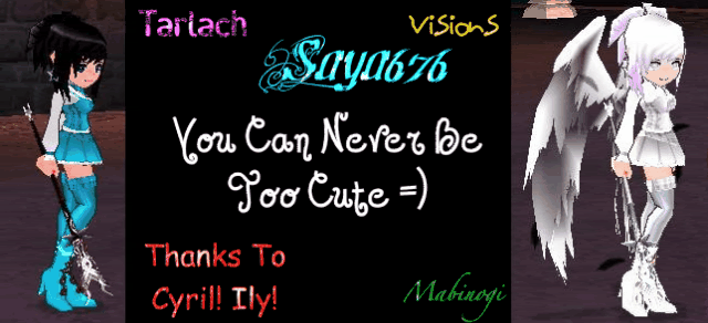
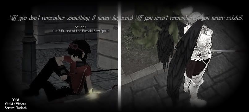
_________________ All Visions Website Graphic Archive. You might remember some of these: Click here!
|
|
|
|
re: [LoT] Logo Style Comparison
by Emissary256 on 2010/10/11 23:26
Maaaaaaybe we can copy-cat this flag's format as reference/allusion as a motive

^*finally learned how to do this*
http://en.wikipedia.org/wiki/California_Republic
^We miiiiiiiiiiiiiiiiiiiiiiiiiiiiiiiiiiiiight be able to link the League of Tarlach with the Bear Flag Revolt (mentioned within this article)
Just a spontaneous thought instigated from Bear-Tarlach.
|
|
♥ Saya ♥The Sexiest Mage in Visions.

Awarded:
Joined: 14 Apr 2010
Posts: 1106
|
re: [LoT] Logo Style Comparison
by ♥ Saya ♥ on 2010/10/12 15:49
Oh wow... i think i know which one won!!
_________________ LOL WIN! FLASHY MABINOGI! xD!!!
|
|
AkaOkamiThe Daydreamer

Joined: 14 Apr 2010
Posts: 970
|
re: [LoT] Logo Style Comparison
by AkaOkami on 2010/10/12 20:16
| ♥ Saya ♥ wrote: | | Oh wow... i think i know which one won!! |
Hmmm..... 6:2 Lemmme think bout it....
Oh of course!~
_________________ 
|
|
Cyril0321Cyril0321Council Member
Awarded:
Joined: 25 Jul 2009
Posts: 2579
|
re: [LoT] Logo Style Comparison
by Cyril0321 on 2010/10/12 23:07
Lol well you know Style 2 is simple and clean. I think if we were expanding LoT's "target market" to people in real life, I think Style 2 would be much preferred because I can see that going easily in T-shirts and so many other things so cheaply! =P
But ofcourse LoT is for the website/game so I suppose it makes sense if we go for Style 1! xD
_________________ All Visions Website Graphic Archive. You might remember some of these: Click here!
|
|
manasouSoysauce

Awarded:
Joined: 19 Jun 2010
Posts: 739
|
re: [LoT] Logo Style Comparison
by manasou on 2010/10/13 1:16
I like style 1 because it states exactly what LoT does. The slogan should be in a different color (like yellow) just to differentiate from the title itself. I'm sure you could make the center more interesting. Tarlach and the bear in the background I think is a bit silly. XD Actually the ring is very abstract compared to the center, so either make the center more abstract (possibly vector Tarlach) or make the ring less abstract. :] Hope my critique helps!!
|
|
Cyril0321Cyril0321Council Member
Awarded:
Joined: 25 Jul 2009
Posts: 2579
|
re: [LoT] Logo Style Comparison
by Cyril0321 on 2010/10/14 14:19
Okay. so Style 1. Do you think we should just make that logo with those colors official?
The logo I think would only be used in the website anyway.
_________________ All Visions Website Graphic Archive. You might remember some of these: Click here!
|
|
AkaOkamiThe Daydreamer
Joined: 14 Apr 2010
Posts: 970
|
re: [LoT] Logo Style Comparison
by AkaOkami on 2010/10/14 14:22
| Cyril0321 wrote: | Okay. so Style 1. Do you think we should just make that logo with those colors official?
The logo I think would only be used in the website anyway. |
I think it looks awesome the way it is ^^
Great job =3
_________________
|
|
|
|
re: [LoT] Logo Style Comparison
by Consort (The New Stork) on 2010/11/17 16:47
I am very fond of the first logo I think its nostalgic in a good way.
Sigh G1~ Invokes a hazy flash back.
|
|
|
|